Rare enough is it to for you to find a mall of early vintage still standing. Even rarer is finding a vintage mall surviving with ease. And rarest of all is finding a vintage mall lead a world-class shopping district known around the world. Lenox Square is all of this : a 1959 mall that miraculously survives today despite everything that has gone on around it. Sixty years of change in its area and the area is truly the reason for how well the mall is doing. Unlike most other malls of its age, Lenox Square rolls along without a problem. How did it get here? This post will address just how Lenox Square remains successful now and into the future.
 |
It's always a good sign when there are tons of postcards on a mall. Sure, retailing was much crazier and malls were much more back then, but still. That's a Kresge's on the right and Muse's on the left. Davison's is on the far left. Scenic South Card Company.
|
 |
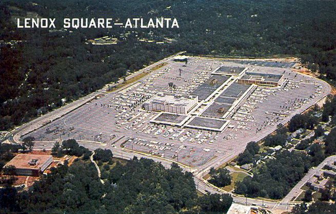
| An old aerial photo of the mall. The block near the bottom right of the mall once contained a Colonial supermarket. |
 |
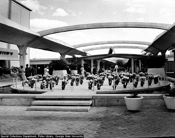
| Rich's court in all of its black-and-white glory. From a Georgia State University photo collection. |
Lenox Square was born in August of 1959 as Atlanta's second mall. The first Atlanta mall was the Stewart-Lakewood Center in the southside of the city. SLC still stands today in its original form, though with one side of the mall knocked down. Anyways, that's a story for another day. Lenox opened up with a pretty much a full set of Atlanta stores ; Rich's, Davison's, and Colonial Supermarket all had a piece of the retailing pie. Another notable fixture of the mall was a Delta Airlines kiosk, operated by the hometown airline. The largest national chain in the mall was a Kresge's five-and-dime. It's also worth mentioning that the layout of the mall at opening was far from unique. Southdale Center in Minnesota, built three years earlier, has a nearly identical history with the mall, as with a few other early shopping centers. Yet this didn't seem to matter, as Lenox did exceptionally well through its youth.
 |
Another aerial photo, this one from Malls of America. Note how the surroundings of the mall are all forest and not nearly what it looks like today.
|
 |
| As one would expect, the grand opening was special. This photo is a good one, especially with a full list of original stores smack-dab on the sign. |
Even without a bump in the proverbial road of youth, there was still room for improvement. And would Lenox improve in 1973. A new, fully-enclosed, one-story wing anchored with the Dallas-based, upscale Neiman-Marcus chain was completed. The addition of any store is certainly a thing to celebrate, but the impact that the expansion would have on the mall was tremendous. This feeling wouldn't truly kick in though for decades. Of course, that doesn't mean expanding was a bad idea. A new, enclosed wing with a unique store helped protect the mall against incoming competition. And in its current form, Lenox was growing vulnerable to this.
 |
| Taking photos was basically a science in the midst of holiday shopping. This was not helped by the presence of kiosks. |
 |
| Macy's court through a forest of kiosks and a fountain as the centerpiece. Think of how bright and beautiful this court would be without fidget spinner merchants. |
 |
| This entrance wing leads to the parking deck just outside Macy's. Sorry for the blurriness, as I mentioned it was not easy to do this. |
 |
| Another, much-clearer image of a simple entrance wing. This appears to be roughly opposite of the Macy's entrance. |
Following two booming decades, Lenox Square remained relatively unchanged for another two. Rich's would expand with a new budget store and Men's Department in 1982. A year before, a food court, large renovation, and expansive Plaza Court was completed. In 1992 though, the latest major expansion for the mall was finished. This added a second floor to the main north-south corridor. Turns out something really hit with this new level, as Rich's expanded once more in 2000 bringing the store up to nearly 450,000 square feet. It really goes to say something to Rich's that their generally middle-class, fairly-normal department store did this well in ultra-luxury, over-retailed Buckhead, especially given the competition against the likes of Saks, Lord & Taylor, and Neiman-Marcus. However, the closure of the downtown store in 1991 and the fact that Rich's was from Atlanta were probably helping.
 |
| This oddly-angled shot shows a Panera Bread and another entrance. Am I the only one who thinks mall Paneras are endangered? I swear these were a lot more common about a decade ago. |
 |
| Say all you will about the interior design, but the layout is simple. |
 |
| The aforementioned Panera is to the left and Macy's is straight ahead. Old malls were odd in the fact that anchors didn't often bookend corridors but were instead built into the mall itself. Anchors were essentially very large inline tenants. |
Unfortunately, and to many Atlantans dismay, Rich's was consolidated into Macy's beginning in 2003 and ending in 2005, but there was a little good news. Thanks to the mall's classy clientele, Federated could afford turning the existing Macy's into the city's second Bloomingdales. A new search for a new anchor was avoided, and the mall's luxury status was solidified. In 2009, the mall was able to celebrate its 50th birthday, which is something to say in the retail industry. Fifty years is a hundred factoring in competition, consolidation, and demographics. That last one makes this feat especially amazing.
 |
| Detail of the center court fountain. As you can see on previous photos, this structure goes straight up in the air and is much larger than what is seen here. |
 |
| Here we have the "Luxury Wing", which isn't a bad name given the Neiman-Marcus anchoring it. |
 |
| A closer look at Neiman-Marcus. |
Today, Lenox is doing quite well for itself in the hellscape that is retail today. In fact, it is doing so well that I would go to say that Lenox can survive another sixty years if the ownership knows what they are doing. Of course, luck is going to have to work out as well. Luck has really come in handy for the mall in its first six decades. It's a wonder in itself that Lenox has lasted this long, given how much demographics can change in sixty years. But not only did the demographics stay stable, they got better. Way better. An old mall in a traditional, middle-class suburb is cool, but a mall surrounded by the likes of Arthur Blank, the former homes of Tyler Perry, and a playground for the wealthy is even more impressive. And even if Lenox was that middle-class mall, it could be dying. North Atlanta is filled with a mall seemingly around every corner, and this would have worn on Lenox over time. Essentially, the money is the blood for the mall. Without it, Lenox would have ceased to exist by now.
 |
| Though it may not seem like it from a distance, the Neiman-Marcus wing has some quirky design features. Note the markings above the second floor logo. |
 |
| Even the stores in this wing are much different than what you would see. No kiosks in this wing. Instead, we have vintage early 19th century pianos for sale, and a look at the price tag is definitely turning away some shoppers. Would you pay $130,000 for a piano constructed in 1900 and imported from Europe? |
 |
| Here we are looking down the main corridor towards Bloomingdales. I really like the tarp-like skylights incorporated in this mallway. It kinda gives some futuristic vibes that really go well with the 1959 beginnings of the mall. The skylights also work well with how bright the corridor is in general. |
 |
| The mall continues down towards Bloomingdales with the only major difference coming in the change of skylight design. |
Where this money also helps the mall is that the mall controls its own destiny. With the fact that Lenox is THE mall in Atlanta and that the money isn't likely going anywhere, Simon has oodles of leverage on what they feel like doing. Doubling the size of the mall is as doable as keeping things where they are. Despite all these possibilities, I don't think Lenox is going to make any drastic changes. As the old saying goes, don't fix it if it ain't broke, and Lenox for sure ain't broke. It would also be unlikely that if new stores were added, they would remain as pricey and upscale as the others in the mall. Besides, from a business standpoint Simon would essentially be shooting themselves in the foot as Simon-owned Phipps wouldn't benefit at all and might even suffer with an expansion. So, even if keeping things normal isn't flashy, perhaps it's a good thing Lenox remains the same.
 |
| Bloomingdales pretty much just sneaks into the mall corridor. This remains a vestige of older malls, as older malls didn't tend to have anchors bookending corridors but instead having anchors blend freely with the corridors. |
 |
| If anything is really amazing in this mall, it might be how much this court area has been changed since its construction. |
 |
| A closer look into the abyss that is the food court and Bloomingdales court reveals a seemingly-suspended California Pizza Kitchen and layers of stores. In all of the many malls I've visited, this area remains a favorite. |
Contrary to many other malls, Lenox is one that doesn't have much to worry about down the road. In fact, it's entirely possible that if Macy's closes as a company and only Neiman-Marcus remains, Lenox will survive. I would go as far to say that Lenox is nearly immune to anything. And so, this story of a long-standing mall won't end with any foreshadowing. It ends with a sort of content-ness about the future. Down the road into the night it seems that there are no nightmares, only dreams of unknown benefits.
 |
| Looking across the court to Bloomingdales. This shot would be perfect had Oprah been elsewhere and not staring into my camera. |
 |
| This look from the dungeon of the food court up really shows the detail in the court. It's quite beautiful. |
 |
| We head back to the main corridor, this time on the second floor. |
 |
| Turn around, and here we have Bloomingdales and the end of the second floor. |
 |
| The Neiman-Marcus wing looks awfully cavernous from this angle. |
 |
| What better way to end a beautiful mall with a beautiful view of Buckhead's skyline and a parking lot with more than a few six-figure vehicles. |


